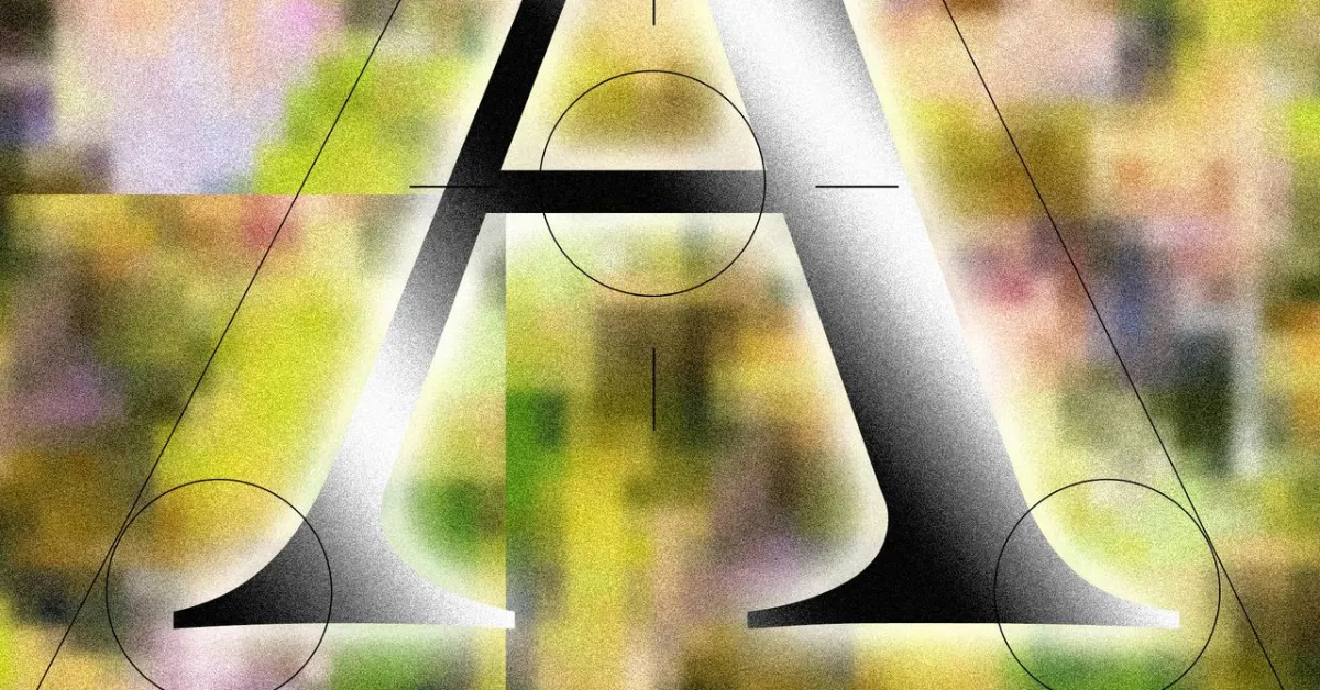
As public scrutiny of AI intensifies, a new trend is emerging: serif fonts are becoming the go-to choice for AI companies, signaling a move away from sterile, digital aesthetics towards something more human and trustworthy.
This shift, dubbed "the serif renaissance" by writer and designer Keya Vadgama, is seen as a deliberate attempt by AI-native companies to project personality and warmth. Vadgama explains that AI is inherently cold and lacks opinion, so using serif fonts — which have origins in calligraphy and connote a human touch — helps companies signal that their products, while AI-driven, are made by and for real people.
Companies like Anthropic's Claude, Runway, Perplexity, and Manus have adopted serif typefaces in their user interfaces and branding. Perplexity's chief communications officer, Jesse Dwyer, emphasizes that their product is for people, hence the human-centric design. Vadgama believes this choice is about more than just aesthetics; it's about building confidence and trust with users, suggesting that sans-serif fonts (like Arial or Helvetica) can feel too clean and computer-like, while serifs offer a sense of dignity and authority.
The association of serif fonts with authority and scholarship dates back to their use in print media like books and newspapers, and famously by Encyclopedia Britannica. Ali S. Qadeer, chair of graphic design at the Ontario College of Art and Design, notes that serif fonts carry connotations of scholarship, and even Anthropic's Claude uses a brown background reminiscent of book pages to evoke a feeling of reading print, further deepening the association with trust.
This trend is also a response to broader public suspicion of AI. While some online critics have labeled the AI adoption of serifs as "generic" and "ugly," experts like Qadeer and Vadgama see it as a deliberate rebranding effort to soften AI's perceived lack of soul. The sterile look of tech that dominated the past two decades has increasingly negative connotations, prompting this move towards more approachable typography.
However, not everyone views this trend with alarm. Some, like designer Yitong Zhang, see it as a pragmatic experimentation phase, comparing AI's current aesthetic development to a teenager trying out different fonts. Vadgama also points out a potential dishonesty in using serifs to downplay the "scary AI" perception, arguing that font choice doesn't fundamentally change the nature of the company. Ultimately, AI models themselves, when prompted, acknowledge the use of serifs relates to perceptions of trust, authority, and even a "networked herd mentality," suggesting the aesthetic choice aims to mask the underlying AI reality.